Skip to content
(845) 492-9707Free growth audit
←   All selected workCase study November 2026

Red Barn Bakery Irvington, New York

Made from scratch. Made to feel like Red Barn.

The project

Since 2007, Randell Dodge has built Red Barn around organic ingredients, small-batch, scratch-made baking and the people behind the food. Sileon gave that story a distinct online home, with the menu, bakery and ways to visit clearly presented.

Explore the live website
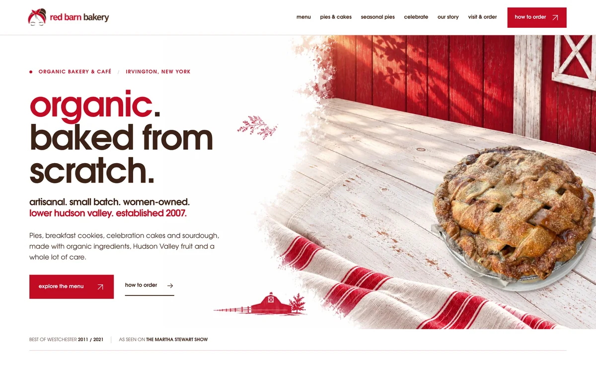
Red Barn Bakery homepage showing its organic, baked-from-scratch message beside an apple lattice pie
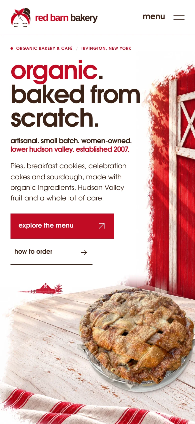
Red Barn Bakery mobile homepage as captured from the live website
01 The live buildOrganic bakery & café Irvington, New YorkVisit site ↗
02 / The briefWhat guided the design

Start with what makes Red Barn worth a visit.

It would have been easy to build another polished café template. Instead, the visual direction came from Red Barn itself: the lattice pie, the red barn, the food photography and the details of Randell’s story. The website has to feel specific to the business it represents.

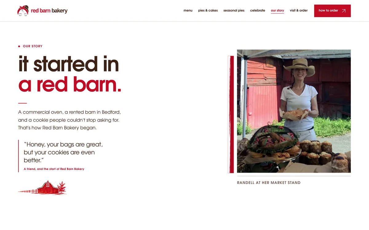
Red Barn Bakery's Our Story page, featuring the origin in a red barn and Randell at her market stand
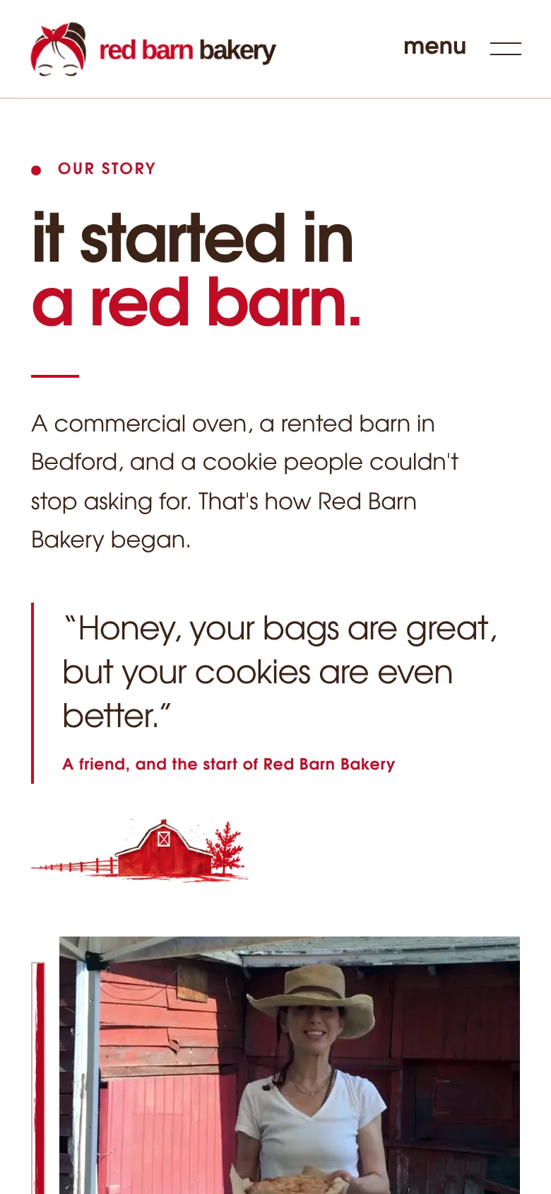
The same Our Story page displayed on a mobile phone
From the real site Our story
03 / Design decisions

The details are the identity.

Photography, Randell’s story and practical ordering information belong to the same experience.

01

The food leads

The opening photograph and “organic. baked from scratch.” headline tell visitors what matters about this bakery before the menu even begins. Red Barn’s own line sits right beneath it in the same type: artisanal, small batch, women-owned.
02

Give the founder her place

The story follows Randell from the first oven in a red barn to the café in Irvington. It makes the person and history behind the food visible.

03

Make the menu useful

Everyday food, pies and cakes have clear routes. The menu makes dietary options easier to find without crowding the homepage.

04 / The customer path

The next step should be as considered as the first impression.

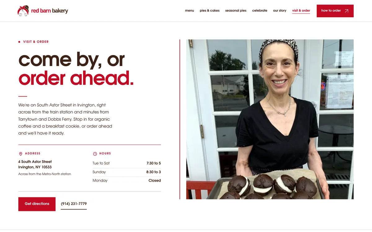
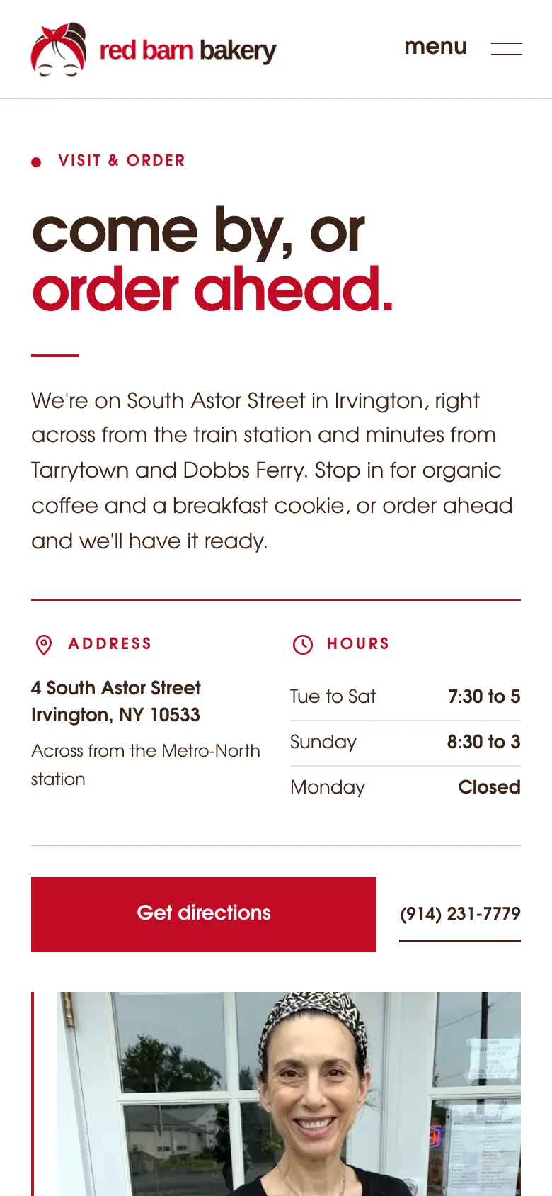
Someone stopping in for breakfast needs different information from someone ordering a cake. The site helps both find the right page, contact details and ordering instructions without making them hunt.

Red Barn visit and order page, with location, hours and options for contacting the bakery
Red Barn visit and order page on a phone
From the real site Visit & order
01

See what Red Barn makes

Menu, pies and cakes have their own clear destinations.

02

Find the right ordering route

Call-ahead pickup and cake or catering inquiries are explained together.

03

Know the practical details

Hours, location, phone and eligible seasonal shipping information are available without guessing.

Launch note

Red Barn’s custom-coded site launched in November 2026. This study documents the design and customer path, not an increase in orders, visits or search traffic.

More Sileon work ↗
Start with the right problem

First, find what’s actually worth fixing.

I’ll look at how customers find you, what they see, and what happens after they reach out. If your website isn’t the issue, I’ll tell you.

Start the free growth audit →